
If planning on being a day trader that preoccupies with stock trading, learning chart analysis is priority, because they represent the basic instrument for technical analysis.
Charts are excellent for getting a visual representation of price changes in the stock market, making it possible to locate unique patterns. With charts, investors can create a map of the price and make projections of its path helping them to formulate trading strategies.

Not surprisingly investors that prefer fundamental analysis tools to select assets to trade, frequently implement charts to select a good entry and exit points.
Every type of chart provides investors the capability to superimpose different technical indicators and to use different chart formats, some are formed by candlestick charts, other bar charts and line charts. Yet one of the frequently implemented charts is the point and figure. It is a basic but organized system for locating present and upcoming price trends.
Also Read: How to Read Forex Charts
Contents
- The Chart Shows Rising Prices
- Chart Pattern with a Long History
- How to Use Point and Figure Charts?
- What do Point and Figure Charts Indicate?
- Calculating the Charts
- Advantages of Point and Figure Charts
- Disadvantages of Point and Figure Charts
- How to Analyze a Point and Figure Chart?
- Difference Between P&F and Renko Charts
- Conclusion
- FAQs
The Chart Shows Rising Prices
The charts are especially practical and it's beneficial to learn the principles that make them a good tool. The point-and-figure chart projects price movements of assets without any input about time.
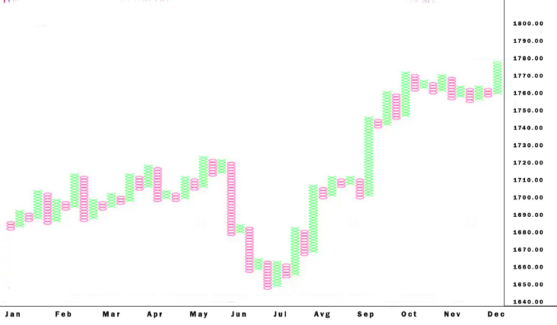
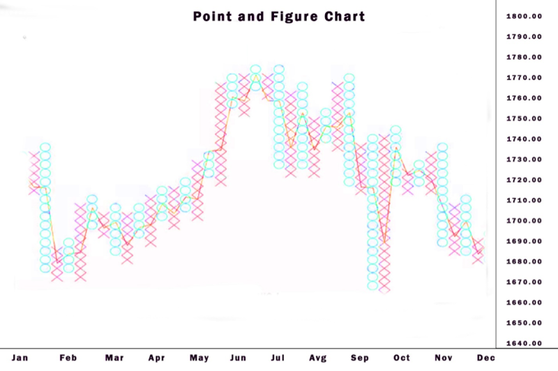
Opposite for other chart types that indicate the amount of the movement of an asset in a preset period. P&F charts use columns created from X's or O's, and they show a set quantity of price movement. The O’s displays a falling price, while the X's show a rising price.
Concepts like resistance and support are still used by technical analysts when observing P&F charts. Few analysts claim that support and resistance levels, but also breakouts, are usually more delineated on a P&F chart because it locates small price movements and is resistant to erroneous breakouts.
The X is formed if the price moves up by a defined quantity, also named the box size. While O gets formed if the price declines the box size amount. The X’s and O's are packed one over the other and will create a sequence of X's or O's.
The box size is formed on the price of the stock.
To make it possible for a reversal of the price it will form a structure with a fresh column of X's after O's or a fresh column of O's after X's, the price has to backtrack by the reversal quantity.
Chart Pattern with a Long History
The first official reference to the P&F charting dates from 1898, and it was called the Figure Charts. The figure charts have developed with X's and several numbers, while the basic P&F charts with X's and O's are creation of A.W. Cohen.
P&F charts were very attractive for a trader in the era before computers because they made it practical to keep a large archive of charts. With rudimentary instruments like paper and pen, traders were able to analyze over fifty charts per day by using P&F charts.
How to Use Point and Figure Charts?
The basic capability of a point and figure chart is to show the volatility of an asset's price in a selected time period. Typically, the arithmetical y-axis displays just units of price. It shows how many times the prices went up or down, and the x-axis signals time intervals.
The described quantity used is known as box size and is precisely connected to the contrasts amid y-axis markings.
Arrangements on the chart are completely in the form of packed X’s and O’s, and both show a quantity of price movement. The X’s show the number of times the stock went up by the given limit, and O’s show the number of times it fell by it.
What do Point and Figure Charts Indicate?
Point-and-figure chart patterns signal forthcoming proceeds or declines based on previous price movements. In this aspect point and figure charts are an instrument that investors use to select the best time to purchase or sell assets.
What’s interesting about these types of charts, and this has already been revealed is these charts do not display a timeline and are formed of price swings.
Showing the price in moments that it performs a serious move is the key aspect of point and figure charts. When there is nothing important occurring at a certain time, then the chart will stay empty.
Point and figure charts are perceived as driven by news events because breakouts and reversals are triggered by breaking news.
Calculating the Charts
There is no formula required, yet there is a need of 2 variables, the first is the box size, and that can be definite amount of money, a percentage of the present price, or it can get based on average true range and that signals that the box size will change in relation to volatility.
Additional thing that has to be adjusted is the amount of reversal, which is usually 3 times the box size. The reversal is not limited and is open to the investors preferences.
Alternative variable is to use high and low prices for the asset or a closing price. Implementing high and low prices indicate formation of additional X’s and O's, and implementing just closing prices translating into smaller X’s and O's formed.
Also Read: Backtesting Trading Strategies
Advantages of Point and Figure Charts
Let’s have a look at the pros:
- Investor sentiment contained: Investors purchase or sell not based on emotions, but with the point-and-figure signal. When a no signal is present, any update on the news channel will not hesitate the investor to make a trade.
- Breakdowns and breakouts are clear cut: Purchasing and sell signals are not arguable. Yet a signal must be backed up with encouraging prof, also evident from the chart.
- No arbitrary drawing of trend lines: The rules for creating trend lines on point and figure charts guarantee compactness correlated with other charts methods like bar and candle, in this cases subjectivity is possible for a trend line positioning.
- Point and figure charts display large clear bands of support and resistance because noise is eliminated.
Disadvantages of Point and Figure Charts
We can analyze the cons:
- The formation of signals is conditioned on reversal and box size scale: When the parameters of the chart are modified it can determine if a signal appears or not. The identical box reversal method and scale must be used on every chart to guarantee stability in point and figure charts.
- P&F charts don’t display gaps: Overnight gaps are not obvious. This creates difficulties for intraday or swing traders.
- Absents of volume on point and figure charts. Investors and technical analysts see value in volume. Yet these charts bypass volume, this creates a situation where investors must consult and find extra prof.
How to Analyze a Point and Figure Chart?
Similar to other type of charts traders can implement indicators like supports, resistance, and moving averages and other patterns to analyze the movements of a given P&F charts.
Investors have to look for 4 things on a Point & Figure chart: up and down lines of the trend, and resistance and support levels.
Traders can spot the support levels easily on P&F charts. Investors create a line at the low of an arrangement of O’s with the same lows.
Traders can draw a horizontal Resistance line at the high of a sequence of X-Columns with equal highs.
Difference Between P&F and Renko Charts
The Renko charts are also based on box size, and if the price moves by the box size it forms an up or down brick that goes at a to the previous brick. Renko charts don’t have bricks close to one another, and a reversal happen if the price goes the other way by two box amounts.
The key difference amid the types of chart types is the look. P&F charts are side-by-side columns of X's and O's, and Renko chart are formed from a sequence of boxes spread out.
Conclusion
Point and figure charts are frequently presented as the most basic method for selecting distinct purchase, sell, entry and exit points. The charts provide options to visualize price movements and trends without taking into account passed time.
Point & figure charts are original in that they do not incorporate the time as a factor in the representation of the price movement, something that is not the case of other chart patterns.
It is great for analyzing powerful trends, because most tiny counter-trend movements are removed. When traders implement Point and Figure charts, they need to observe the current asset price to minimize potential for loses.
The chart patter eliminates the market noise and provides information about the performance of the stock. They are easy to understand and a great tool for price target estimation.
Trends reverse slowly and investors must be aware that P&F charting is created for long-term traders and is of no use for short-term investors. Technical investors implement charting to locate the general price trends, and open positions that have profit potential.
P&F charts can be slow to react to price changes. A breakout will have to advance the box amount in order to signal that a breakout has happen. Creating advantages for investors because they can minimize fake indicators about the breakout, and the price has advanced the box over the breakout point. Few investors receiving the signal following the price advance that it cannot be effective.
While P&F charts can minimize the amount of faulty breakouts, but they will still happen. If something looks as a breakout can get backtracked a short time afterwards.
The P&F charts are great for retaining investors in potential trends, and plenty of tiny counter movements are filtered out. But if a reversal happens it can eliminate profits. The reversal quantity is generally huge, and when investors is implementing P&F charts they will spot reversal until the price has goes contra them.
When using P&F charts, traders need to observe the current price of the stock and the risk can get be monitored in real time.
FAQs
What Is a Point and Figure Chart?
Point and figure charts offer a method for visualizing movements in price and trends of an asset without taking into account time as a factor.
Do Point and Figure Charts Work?
They are perceived as an old technique for charting price movements, yet they are still practical and can generate solid results.
How do You Use a Point and Figure Chart?
The crucial aspect in point-and-figure charting is the box size, in other word the quantity of price movement that chooses if a new X or O is added to the chart. We can take an example, if the price range box size is $5. And if the last X occurred at a price of $10, a new one is added to the preset column of X's when the price climes to $15.
How do You Create a Point and Figure Chart?
Creating the chart begins by finding the highest high and lowest low of the day and implement alterations in relation to what you observe.


