MACD Histogram & Crossover: Everything You Need to Know

Momentum trading can be a nerve-wracking experience. If done right, you can rack up a lot of profit quickly. If not, you can falter and make wrong buy/sell decisions that can send you down a spiral of losses. One tool to help traders in momentum is the use of the MACD indicator and the MACD histogram. Here, we will discuss how you can make the most out of it.
Contents
- What is the MACD Histogram Momentum Indicator?
- MACD Histogram Calculation Formula
- MACD Histogram Color
- MACD Histogram Settings
- MACD Histogram Values
- MACD Histogram strategy
- MACD Histogram TradingView
- MACD Histogram Alert
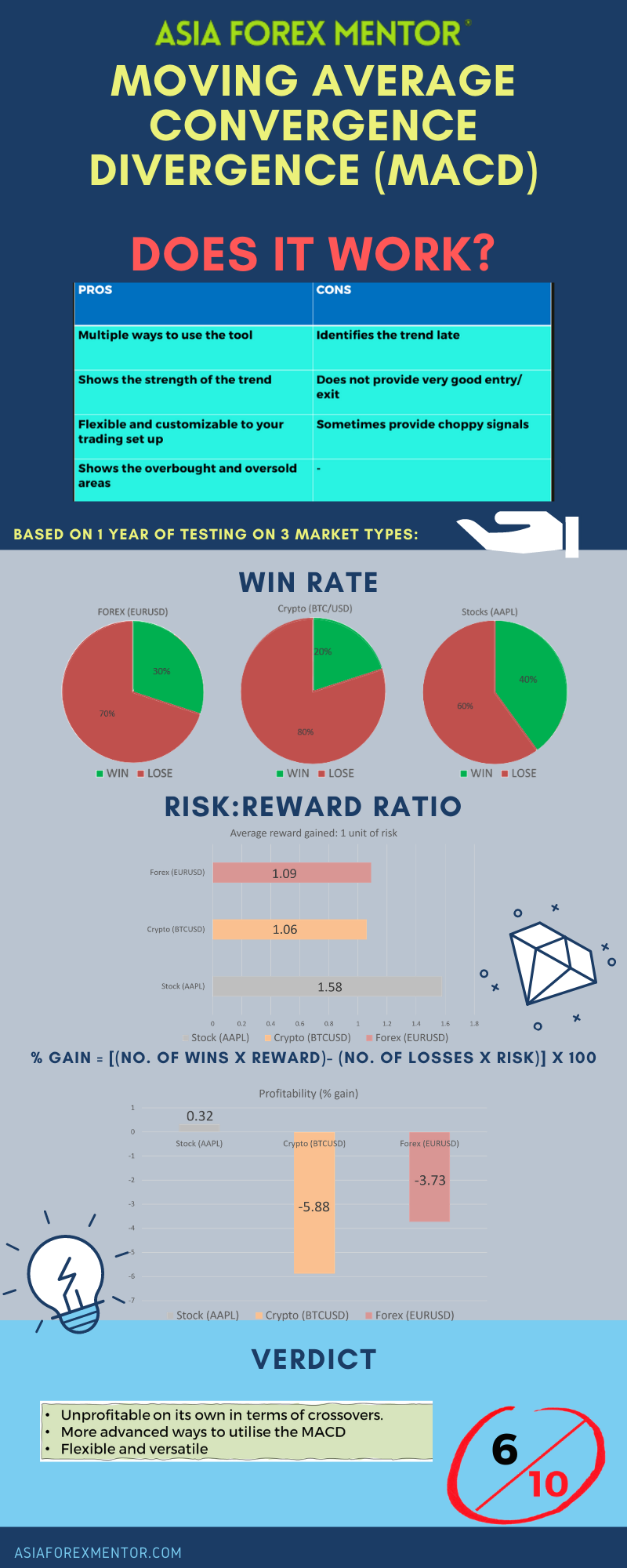
- MACD Pros and Cons
- MACD Crossover strategy
- MACD analysis
- MACD Conclusion
- MACD Rating
- Infographic Representation
What is the MACD Histogram Momentum Indicator?
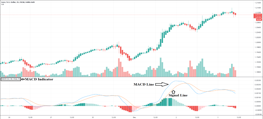
The Moving Average Convergence Divergence (MACD) is an indicator that tracks trend momentum. It shows the connection between two moving averages of a market’s price. You get the MACD by subtracting the 26-period EMA from the 12-period EMA (Exponential Moving Average). With this, you have the MACD line.
The MACD indicator alone does not provide enough information when it comes to buy or sell signals. For this, you will need the signal line. The signal line is basically a 9-day EMA of the MACD. With this line plotted over the MACD line, you can easily see when to buy or sell.
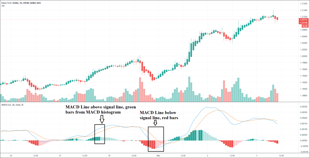
For instance, if the MACD line is above the signal line, then your bias is to go short. Conversely, you go long when the MACD is below the signal line. There are many ways to look at the MACD indicator. However, most traders use it to identify divergences, crossovers, as well as rapid rises or falls. We will discuss MACD indicator strategies later.
MACD Histogram Calculation Formula
The MACD line is generated based on a calculation which subtracts the 26-period EMA (also called long-term EMA) from the 12-period EMA (short term EMA). From this, we can have the MACD histogram by subtracting the signal line from the indicator line.
The EMA is a type of moving average that prioritizes more recent data points. EMA is sometimes called the exponentially weighted moving average. The difference between EMA and SMA (simple moving average) is that EMA gives more weight and significance to recent price changes. SMA merely applies an equal weight to everything in the period.
MACD Histogram Color
When you enable the MACD indicator, an indicator below the price chart. (Read about other indicators here: ATR Indicator, Stochastic Indicator, RSI Indicator) The MACD line is the blue line and the signal line is the orange line. Usually, when you enable the MACD indicator, it also provides you with the MACD histogram. Here, you are given bar charts that move with the two lines, which is the histogram.
MACD Histogram Settings
While some traders have unique MACD histogram settings, you are better off sticking to the default settings. This is because the market is an ever-changing platform. Even though you found a setting that works today does not mean it will be effective tomorrow. So the best way to make the most out of the MACD histogram isn’t to optimize the settings, but rather to look at the signals produced from the default settings and learn how to go from there.
MACD Histogram Values
The value of the MACD histogram can be positive or negative. It is positive when the short-term EMA is above the long-term EMA. Conversely, it is negative if the short-term EMA is below the long-term EMA. The distance between the MACD to its baseline, whether above or below, indicates that the distance between the two EMAs is increasing.
MACD Histogram strategy
With the theories out of the way, let’s talk about how you can use the MACD histogram to identify entry and exit points. Keep in mind that engaging in momentum trading like this requires a nerve of steel. This is one reason why momentum trading is difficult because you need to wait for the right moment before taking action, and many people fail to do so and end up selling themselves short. The strategies below should help you get started.
Entry Strategy
Dr. Alexander Elder created the impulse system, which is used to identify entry points by using a momentum indicator to measure market inertia and another indicator to measure the momentum. In this case, we will use the exponential moving average (EMA) to measure the inertia and the MACD for momentum, both of which are included in the same MACD indicator.
When the EMA rises, the inertia has a bullish bias. When the EMA falls, the inertia has a bearish bias. For the MACD histogram, if it rises, then the bullish momentum is picking up steam. If it falls, then it is a bearish momentum. Below is the MACD indicator with the MACD line and signal line invisible and the EMA indicator enabled.
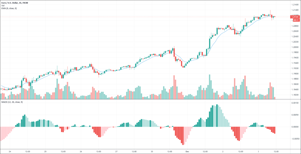
For this system, you are looking for the moment when the EMA and MACD histogram are pointing in the same direction. That would be your entry signal. This is because the inertia and momentum are pushing the trend upward or downward together. So, when both EMA and MACD histogram are on the rise, that means it is a bearish momentum and the trend is most likely to continue to go up. Conversely, if both EMA and MACD are going down, that means the trend is going down. (Also read about: Trendline Trading)
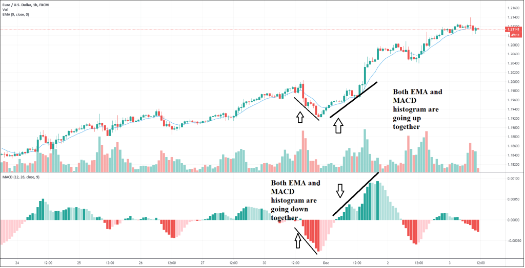
There is a way to refine your entry points. If you are comfortable with trading with the daily charts, for example, then you should take a look at the weekly chart. You should analyze the bearish or bullish tendency of the market. To help you identify the market’s trend on a larger time scale, use the 26-week EMA and weekly MACD histogram for the weekly chart.
When you know the long-term trend, you can go back to the daily chart and trade with the trend. In other words, you trade with the bigger picture in mind, thus minimizing risk. (Also read: Risk Reward Ratio) Favorable trades here are those that move in the same direction as the long-term weekly trend. In this case, you can use the 13-day and MACD setting of 12:26:9 and you can wait for the right signal.
Below is an example of the weekly chart and daily chart (respectively) both showing an upward trend, which indicates favorable trades.
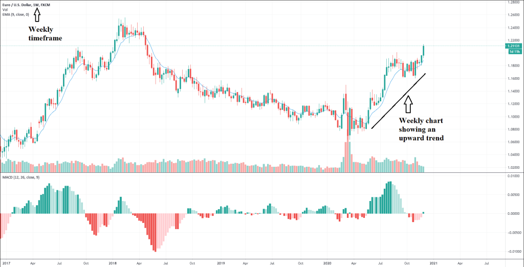
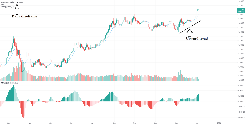
We will use the daily chart for our trading and the weekly chart to observe the long-term trend. You can trade in a different timeframe as well. To determine which is a viable long-term chart, simply multiply your current timeframe by 5 to 7. For instance, if you trade on the 15-minute chart, the bigger timeframe is 1 hour and you should look at the 1-hour chart to identify the larger trend at play.
For instance, if you trade on the daily chart and use the weekly chart for reference, you wait until the 13-day EMA and the MACD histogram to go up together. That is a strong buy signal and you should go long and stay there until the signal disappears, which is when the EMA and Histogram no longer go up together.
On the other hand, if the weekly trend is going down, wait until the 13-day EMA and MACD histogram to go down on the daily chart. That is a good sell signal and you should go short then. Moreover, you should be ready to cover the short position the moment the buy signal disappears.
Techniques for Exiting Positions
Momentum trading can be very effective in both markets with a strong trend or choppy ones because it is done in a short timeframe. The best markets in any week are those that have strong intraday trends, and that is where you should be trading. This is why momentum trading requires a nerve of steel as intraday trading can be nerve-wracking. That said, remember to hop off the momentum train before it goes down and take your profit with it.
We’ve already covered the entry strategy. Your exit point is the moment when any of the indicators stops going up. On a daily trading chart, the MACD histogram tends to make that divergence first as the momentum of the trend weakens. Of course, the momentum slowing down means that the buy signal is gone. To some traders, that is not a true signal. However, using the impulse system, that is a sell signal.
If the weekly trend is going down and the EMA and MACD histogram are also going down on the daily chart, and that you are in a short position (and you should), it is best to cover your shorts the moment any of the two indicators stop giving a sell signal. That is when the downward momentum is losing steam and has already done most of its descent. You should sell before the trend hits rock bottom.
Unlike entry points, exit points require you to be quick on your feet take action the moment you see the trend is reaching its end. The whole system is all about riding the momentum so when it loses steam, you get out.
MACD Histogram TradingView
MACD Histogram is available on TradingView as well as a whole host of other forex online platforms. For TradingView, you need to create an account with them first before you can use their advanced features.
MACD Histogram Alert
Forex trading may not provide the most exhilarating experience most of the time. You can get bored or distracted and could potentially miss an entry or exit point if you don’t keep your eyes on the moving chart. For this reason, the community has created various MACD histogram alerts to ping you when a certain condition is met such as when the MACD line crosses the signal line. Many of them are highly customizable, some of which can send you an email to let you know of any notable update.
MACD Pros and Cons
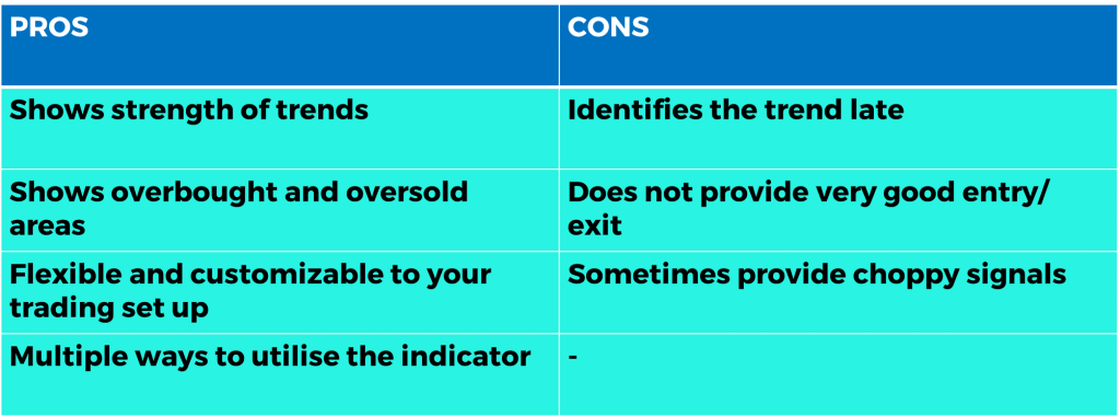
The MACD is able to show the strength of the current market trend via the histogram. On top of that it is also able to identify overbought and oversold areas, whereby, the signal line value is more than the MACD value and where the signal value is less than the MACD value respectively. In addition, the MACD is highly customizable to your trading style. Furthermore, the MACD has multiple strategies alone, making it an advanced tool to master with multiple additions to your trading arsenal. However, it is a lagging indicator, meaning that the MACD crosses might have a few candles of delay, hence not providing the sharpest entry and exit possible. Subsequently, it is capable of providing conflicting signals during choppy markets, making it somewhat unreliable.
MACD Crossover strategy
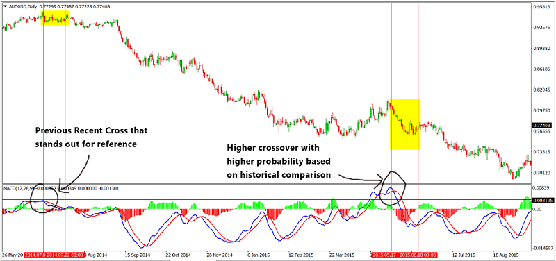
The MACD can give many signals within a certain period, thus it can be a challenge for traders to validate the strength of the signal. The degree in strength of the MACD crosses varies based on historical data. A MACD cross is taken to be stronger, with a higher probability, when the cross is well above the zero line, more than the previous recent cross that stands out. The figure below illustrates this in a live chart..
MACD analysis
The MACD crossover strategy is one of the simplest and widely used strategy out there. To dissect the profitability of this strategy, a series of backtest is conducted in the H4 timeframe.
In this series of backtests, the pair EURUSD is taken as a sample representing the forex vehicle, AAPL is taken as a sample to represent the stocks vehicle and BTCUSD is taken as a sample to represent the cryptocurrency vehicle.
For simplicity, we will assume that all trades taken have a risk of 1% of the account.
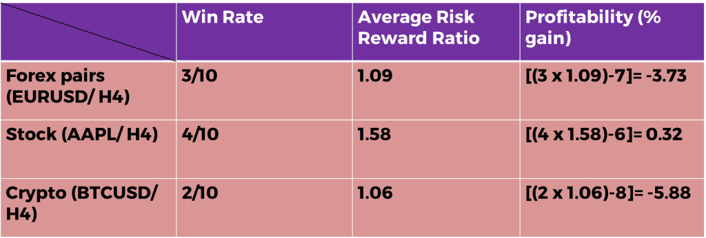
Definitions: Avg Risk reward ratio= ( Total risk reward ratio of winning trades/ total no. of wins) Profitability (% gain)= (no. of wins* reward)- (no of losses* 1) [ Risk is 1%]
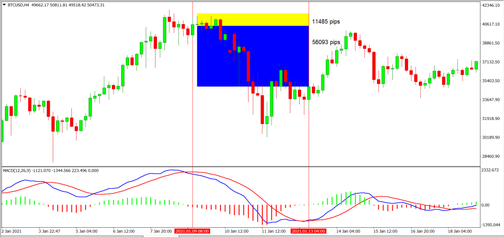
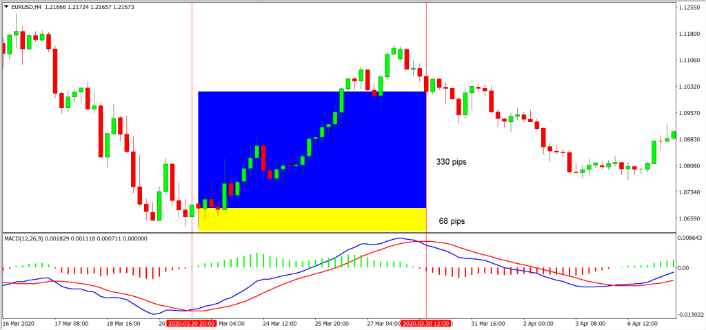
The examples of the backtest are as shown in the following figures:
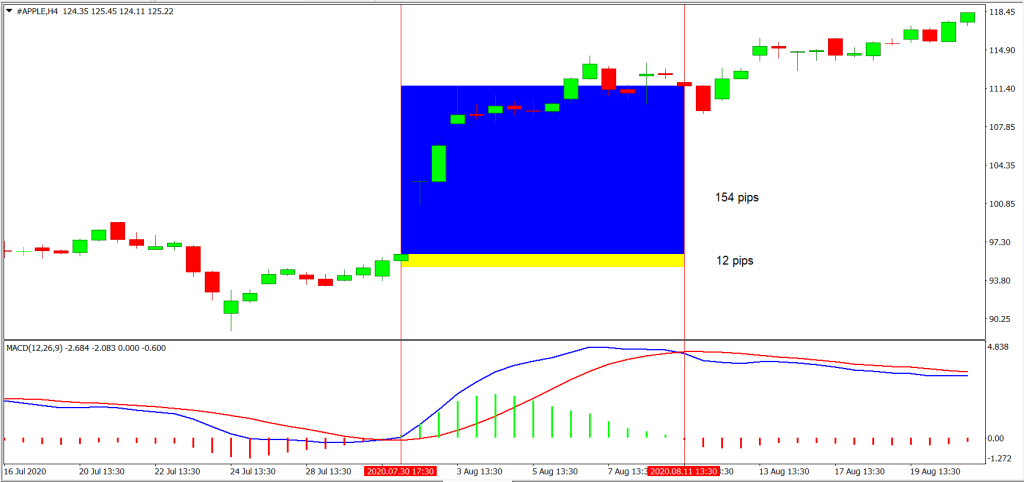
For the Backtest results, trades with blue and yellow zones indicate an overall win with the blue zone as reward and the yellow zone as the risk taken.
As shown in our backtest, the win rate of this strategy for EURUSD (Forex) is 30%, AAPL (Stocks) is 40% and BTC (Crypto) is 20%
The average risk reward ratio of this strategy for EURUSD (Forex) is 1.09, AAPL (Stocks) is 1.58 and BTC (Crypto) is 1.06.
The profitability of this strategy for EURUSD (Forex) is -3.73, AAPL (Stocks) is 0.32 and BTC (Crypto) is -5.88.
MACD Conclusion
Although the MACD crossover strategy doesn’t have a fantastic win rate or an outstanding average risk to reward ratio, hence making it seem somewhat unprofitable, it is only one of the many strategies to utilise the MACD indicator. There are no doubt other more advanced and profitable strategies out there to utilise it. Even so, the MACD is a very useful and widely used tool for indication, alongside other indicators to be added into your setup. Not to mention that it can be customised to fit trading styles as well.
And that is everything you need to know about MACD histogram to get started. If you are not familiar with momentum trading, it is best to start with a demo account with some virtual currency to start so you can get some experience before you put your actual capital at risk.
MACD Rating
6/10
Infographic Representation
