
How to Read Forex Charts
When and where should I begin or exit trading to get maximum profits and minimum losses? That's the question on every financial trader's mind. Thankfully, most charts are usually packed with tools to help answer this very question. All a forex trader has to know is how to read forex charts.
There's a slight bump in the road, though. No single chart reading technique is absolute, risk-free, and 100% accurate. Today's market is so complex that a trader can't exclusively rely on just one chart reading strategy or indicator to achieve winning outcomes all the time.
There are various different variables and models in financial markets leading to an irreducible complexity in real-life trading.
However, by accurately reading and interpreting the charts, one can capture some of the most important variables influencing price movements.
Simply put, being able to read a chart correctly will significantly improve your predictive ability.
Technical analysis is thus the main challenge that we address in this article. In this how to read forex charts beginners guide, we hope to give you actionable chart-reading knowledge for consistently profitable trades.
How to Read Forex Charts
- Assess the Support and Resistance
- See the Trend
- How to Analyze Forex Charts Using the Three-Line Break Chart
- Spotting Micro-Changes in Trends: Renko Charts
- Using Trend-Related Technical Indicators
- Moving Averages
- Mapping out Support and Resistance: Fibonacci Levels
- Time Frames
- Conclusion
1. Assess the Support and Resistance
When you first glance at a chart, try to answer this fundamental question. Where is the instrument's price, and how is it doing? Knowing the location of the price of the currency pair you wish to trade should form the foundation of your chart analysis.
Therefore, the ground floor of analyzing how a forex pair is doing identifies where the support is and where the resistance lies. The most straightforward definitions for support and resistance (S/R) are as follows:
- Support: where the currency pair's price stops falling
- Resistance: Where the currency pair's price stops rising
Figure 1 shows the most recent resistance line for the EURUSD at the time
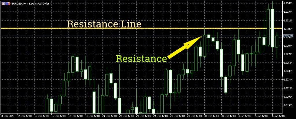
There's always some degree of objectivity and personal judgment involved when constructing S/R lines. The lines are drawn where a set of lows or highs appears. However, they should be drawn with the perspective that you are trying to identify zones and not exact lines.
Once you have identified the points of resistance and support, the next thing you need to figure out is precisely how strong the support/resistance is.
Different traders have different ways of determining the level of strength in the support or resistance. Chart timeframes are probably the easiest way of weighing how robust support/resistance is.
If a support/resistance zone is maintained throughout longer time frames, such as weekly or monthly, a trader may conclude that there's great support/resistance at that point.
Further read: Support and Resistance Forex
2. See the Trend
In the financial trading world, there's a saying that “the trend is your friend.”
Think of trends as projections linking past behavior to the future.
Knowing how to read forex charts means being able to detect and map out a trend. This is a prerequisite if you are going to become a successful trader. It doesn't stop there though, in addition to identifying an ongoing trend, a trader must also know how to detect a potential change in the trend.
In figure 2: you can see an uptrend with price action remaining within the trend lines
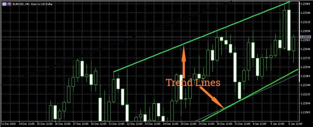
The single, most useful reason for being able to identify a trend is that it helps you decide how you are going to trade—whether long or short.
Generally, a downtrend has excellent sell conditions, while uptrends basically provide traders with buying opportunities.
Further read: Trendline Trading
3. How to Analyze Forex Charts Using the Three-Line Break Chart
The three-line break chart is one of the easiest and popular ways to identify a trend and confirm when there's a trend change.
This is a charting strategy that helps traders confidently identify the trade direction, detect a trend's exhaustion, and subsequently determine appropriate entry and exit points.
Figure 3 shows a line break chart.
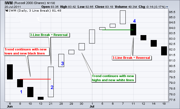
As the figure above depicts, the three-line break chart looks a little like the regular candlesticks but without wicks. This happens because the three-line chart merely considers the open and close prices. The blocks (also known as lines) in the chart only form when the price of the currency pair moves a specific amount.
This chart, therefore, evolves based on price movements, not time.
When looking at the three-line chart, the blocks show consecutive highs or lows. The block's color corresponds to rising prices (green/white) or falling prices (red/black). The pattern arrangement of these blocks indicates the predominant trend direction.
From the chart pattern, it is also easy to tell when the trend has been reversed. A trend reversal may be confirmed when the reversal block goes past the previous three blocks. Some traders refer to this phenomenon as the three-line reversal.
4. Spotting Micro-Changes in Trends: Renko Charts
One of the downsides of the three-line charts is that they're slow to pick up trend changes.
Most traders face the challenge of detecting sudden sentimental changes in the market as soon as they happen. Renko charts beat this challenge by helping you catch the earliest form of change in the trend direction.
Here now is a quick “how to read forex charts” beginners' guide for Renko charts.
Renko means “brick” in Japanese. Each brick in the Renko chart forms only when the price moves and closes at a predefined setting. The bricks move in 45-degree lines up or down based on price changes.
Upwards price movements are represented by green or hollow bricks. Red- or solid-colored bricks typically denote falling price movements.
Figure 4 shows a Renko chart.
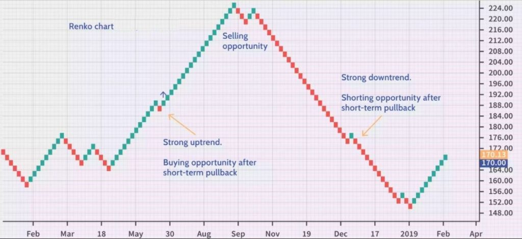
Renko charts filter out minor insignificant price movements. By ignoring these small price fluctuations, it becomes relatively easy to spot the predominant price trend.
Creating a Renko chart begins with setting the size of each brick (either in dollars or pips). A Renko brick will form once the price moves the specified amount.
The bricks are then generated in a consecutive series based on price movements. Thus, it is easy to spot when a micro trend develops.
5. Using Trend-Related Technical Indicators
Now that we have reviewed the basic geometry of trends and support/resistance, the next step is to diagnose the strengths and weaknesses in price action. This is where technical indicators come in.
Technical indicators are equations or algorithms that take the price data and smooth it out. If you already know how to read forex candlestick charts, indicators can help confirm such conditions as:
- The strength of the trend
- Support/resistance strength
- Signs of weakening in a trend or in support/resistance
- Volatility
The goal of using technical indicators in your charts is to attempt to eliminate price movement noise and discover inner patterns and harmony in the market.
There exists a multitude of indicators. The sheer magnitude of the indicators available out there is enough to confuse a new trader. Ironically, most of these indicators aren't particularly useful to your actual trading.
Therefore, we will briefly explain a key indicator that's critical in helping a trader decipher the nature of existing market trends.
Further read: Candlestick Patterns Cheat Sheet
6. Moving Averages
This is the most basic technical indicator for interpreting the trend. Let's now see how to read forex charts like a pro using this trend indicator
It is a simple algebraic average that smooths out price data by calculating the average closing price for the last particular number of periods.
Figure 5 shows that the moving average appears as a squiggly line overlying atop the price action.
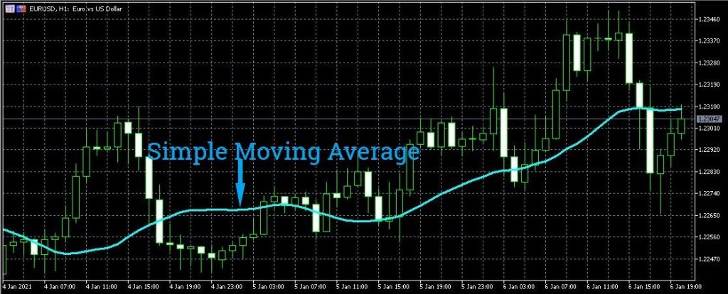
In an uptrend, the currency pair’s price action tends to remain above the moving average. In a downtrend, the price action will be below the moving average.
The most popular moving averages are simple and exponential moving averages. While both are used to gauge a trend's general direction, simple moving averages are susceptible to spikes and may give false signals. Exponential moving averages try to eliminate this shortcoming by focusing on more recent price action.
Other variations of the moving average, including versions of the weighted and adaptive moving averages, have been created to help traders improve their trading outcomes.
Regardless of what moving average you use, consistency in use is critical. If you know how to read forex charts mt4 and are consistent with the indicators you use, you will, with time, improve your analysis and interpretation capabilities.
7. Mapping out Support and Resistance: Fibonacci Levels
In the 13th century, one Italian mathematician, Leonardo Pisano , found that everything in nature, biology, architecture, and the universe contains a string of numbers with unique ratios and mathematical properties.
These number strings came to be known as the Fibonacci sequence, and their wide-ranging presence extends even into the financial markets. Prices in the financial market have been found to move between resistance and support in tune to the Fibonacci syncopation.
A Fibonacci grid is constructed by taking a high point on a chart and connecting it to a low point (or vice versa) to produce Fibonacci retracement levels. Several ratios will be depicted by the horizontal lines of the grid.
The key Fibonacci ratios are 23.6%, 38.2%, 50% and 61.8%. The ratios are commonly referred to as Fib levels.
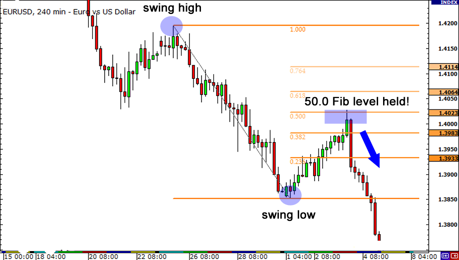
A trader can use Fib levels to identify possible support/resistance levels as well as potential price reversal points. The primary assumption is that when a price reaches a particular Fib level, it experiences strong support or resistance.
A trader must be careful not to treat Fib levels as predictions of how the price will behave. They are merely maps of potential support/resistance zones.
8. Time Frames
Traders can consistently make money in the financial market if they are able to identify an underlying trend and structure their trades accordingly. In short, you need to know when to get in and out of a trade position based on the trend. This essentially means that you need to find the best timeframe for your trading style.
Most trading charts are based on different timeframes. Indeed, you'll find that you have many more timeframe choices than you'll probably ever use. Thankfully, you only need to choose only those time frames that fit your trading style and personality.
To find out which time frame is best for you, you need to answer the following questions:
- How much time is available to you for active trading?
- How long do you wish your money to remain exposed to the market? For how long will you hold your open positions?
- What's your personality? Are you a patient enough person to let things take their time? Do you like the excitement of quick, fast-paced trading?
Based on how you answered the above questions, you may trade long-term, short-term, or intraday timeframes.
Long-term timeframes are for traders who hold onto their open position for longer periods, which may go from a few weeks to several months or even years. Such traders will thus look at monthly, weekly, or daily charts. It goes without saying; patience is key when using these time frames. On the other hand, these timeframes give the trader more time to think through each trade.
Short-term time frames are mostly preferred by swing traders who hold their positions for several hours to a week. Consequently, the charts used by these traders are mostly the hourly time frames.
Intraday traders use minute charts such as 30-minute, 15-minute, or even 1-minute charts.
Generally, longer timeframes give significantly more reliable signals than shorter timeframes. As the timescale shortens, there's a marked increase in noise and false moves. Thus, with a longer time frame, it is easy to define the predominant trend.
Smart traders, however, monitor their trades across multiple timeframes. They review longer-term time frames to confirm their hypothesis about the prevailing trend. The short-term time frames, in turn, help them determine their entries and exits.
Additionally, by being able to trade different timeframes, a prudent trader may seek out which trend opportunities provide the highest chances of success. For instance, one may align themselves with a daily trend, 12-hour trend, and 15-minute trend.
Each time frame has its merits and demerits; nevertheless, one may use trends across different timeframes to confirm their trading decisions.
Conclusion
In this discourse, we’ve looked at how to read forex charts. We reviewed the major components of reading your trading charts, which include trends, trend-related indicators, support, resistance, and timeframes.
By understanding these initial chart reading strategies, you can now begin simulating and anticipating what might actually happen once you place your trade.
As you read and analyze more and more trading charts, you will gradually get better and better at shaping your trader.
Remember, becoming a successful financial trader isn't an instant process—it's a journey of growth and evolution.


