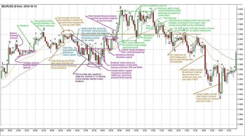
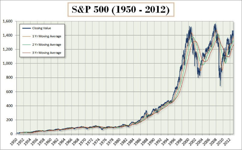
The death cross pattern is a lagging indicator of a bear market. It can be used by day traders and long-term traders to make decisions about the best market entry and exit points and trading strategies.
Death cross chart pattern has formed before the most severe bear markets in U.S. history. In those instances, it signaled not only a bear market but a recession too. The most recent bear cross occurred on 24 January 2022. The 10-day moving average (MA) dropped below the 100-day MA and stayed beneath it until 24 April 2022 when it briefly rose above the 100-day MA before resuming its downward trend.
Death crosses can be used to predict price movements in different markets (e.g., commodities, crypto, stock index, stock market). The death cross signal should be confirmed by other technical indicators before traders act on it. By is not a reliable indicator.
Also Read: Death Cross: A Complete Guide
Contents
- What is a Death Cross Pattern?
- Why is it Called a Death Cross?
- Death Cross Market Signal
- Death Cross Trading Risks
- Key Takeaways
- FAQs
What is a Death Cross Pattern?
A death cross is a technical chart in which a short-term moving average crosses and falls below a long-term moving average. For this pattern, long-term traders generally use a 50-day moving average and a 200-day moving average.
What is a Moving Average?
A moving average is calculated by adding up all the closing prices of an asset during the selected time period, and then dividing the sum by the number of days represented in the sum. The resulting value will be the arithmetic mean. The next day the oldest value in the series will be dropped, the most recent value will be added, and a new arithmetic mean will be calculated and plotted on the chart.
Moving averages are generally plotted in price charts. If the price line crosses the moving average as it moves upward, that is a sign of a bullish trend. However, if the price line crosses the moving average as an asset's price falls, that is a sign of a bear market.

Why is it Called a Death Cross?
A death cross appears when the shorter-term moving average crosses the longer-term moving average and creates an “X”. It's called a death cross because when traders see it, they know that the market is transitioning from bear to bull. Thus, if they don't take action to protect their assets, they will suffer heavy losses, and then that market trend may be the “death” of them.
Death Cross Market Signal
A death cross occurs when an asset's price is about to peak and there is a decline in buying momentum. The decrease in buying momentum shifts market power to the sellers, and the sellers begin to drive the asset's price down as they become increasingly desperate to exit their market positions and reduce their financial losses.
Death crosses are formed when shorter-term moving averages intersect the longer-term moving averages and continue to move downward. The long-term downward movement of an asset's price creates a long-term bear market.

The appearance of a death cross is a bearish indicator. If it is also accompanied by high trading volume, then it is a strong signal of a bear market. The high trading volume is a sign that traders believe that a bear market has developed and that they have decided to sell off their holdings.
Also Read: Bull and Bear Markets: Understanding the Trends That Dominate Financial Markets
Death Cross Trading Risks
A death cross occurred prior to all major economic downturns in the 20th century. However, the death cross pattern occurred numerous times when there were only market corrections. During a market correction, the value of the overall market declines by more than 10% but less than 20%. These corrections are necessary to cool down overheated markets and correct the market value of assets that have been overpriced due to market speculation. This means that when a death cross formed, there was not always a recession and/or long bearish market.
Unreliable Technical Indicator
Traders confirm the meaning of death cross signals by looking at other technical indicators (e.g., MACD, RSI, candlesticks, chat patterns). If those chart patterns signal a downtrend in an asset's valuation, then the trader can be more confident that the event is likely to occur in the future.
Historical Asset Performance
Before using this chart pattern as part of your trading strategy, you should test it in simulations. Assets do not always respond the same way to imbalanced seller and buyer pressure. Some asset valuations may follow the signaled trend, others may consolidate, and still for some others it may result in a reversal of the price trend. The only way to know what is likely to happen is to perform many simulations using the target asset and observe how it reacts to different trading conditions. When you are familiar with the asset and how it responds to changes in trading conditions, then you can more confidently predict its future performance if a death cross forms on its price chart.
False Signals
If higher trading volumes do not accompany the formation of the death cross, it is likely that the death cross is a false one. A false death cross may be followed by a pullback, reversal or consolidation pattern. In such cases, the traders would need to make different trading decisions in order to avoid losing money in the market.
Lagging Indicator
Death crosses are lagging indicators. This means that by the time they appear, the asset's valuation may have already begun to significantly decline. Thus, they are considered to be historical signals. They describe past performance, but do not provide information on current or future market performance. To avoid this problem, some traders focus on asset prices instead of their moving averages. By paying attention to the prices, they have a better chance of entering the market at the beginning of the trend.
Key Takeaways
Death cross stocks are stocks that behave in a predictable way when a death cross is observed on their price charts. These stocks are likely to enter into a long, sustained, downward price movement that occurs at the same time as a bear market and recession. The chart pattern can be used with commodities, cryptocurrency, stock indices, and other types of public markets. Since it is not a strong indicator and must be confirmed by at least two other market indicators, it is considered a weak or minor market indicator.
FAQs
What is a Golden Cross?
The golden cross technical chart pattern is the opposite of the death cross pattern. The golden cross occurs when the short-term moving average, which is below the long-term moving average trends upward and crosses the long-term moving average, and continues in an upward trend.
What kind of Technical Indicator is a Golden Cross?
It is a bullish indicator. If there is high trading volume at the time the golden cross is formed, it is a strong bullish signal. Many investors will begin to purchase the asset if they identify a golden cross in the charts and its signal is confirmed by other indicators (e.g., trading volume, RSI, MACD).
Which Moving Averages are used for Death Crosses and Golden Crosses?
Day traders use shorter moving averages (e.g., 5, 10, 15, 10 minutes) than long-term traders (30, 50, 100, 200 day moving averages). Traders must decide which time periods are optimal for them.


